3 min read
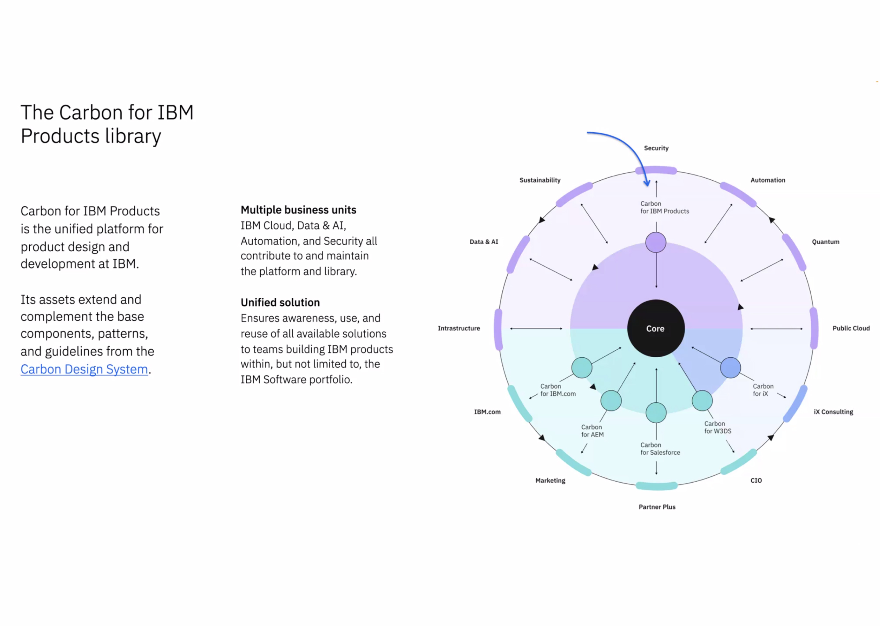
Using the Carbon for IBM Products’ goals and opportunities, we met to align on timelines and scope.
For this case study, I’ll focus on one of the four components I built — the ‘About modal’.
I started by digging into the component and identifying the modal's key differences across Sketch design file, the Pattern Asset Library site, and the code. This proved trickier than expected. Each place contradicted each other and was inconsistent making it difficult to know the source of truth. I reached out to a designer and developer to understand the about modal’s true visual form. Once aligned and approved by others, I opened Figma and began to build.
From all the discussions, I wrote out a small list of to-dos so the designer can choose from the 28 variants for their product.
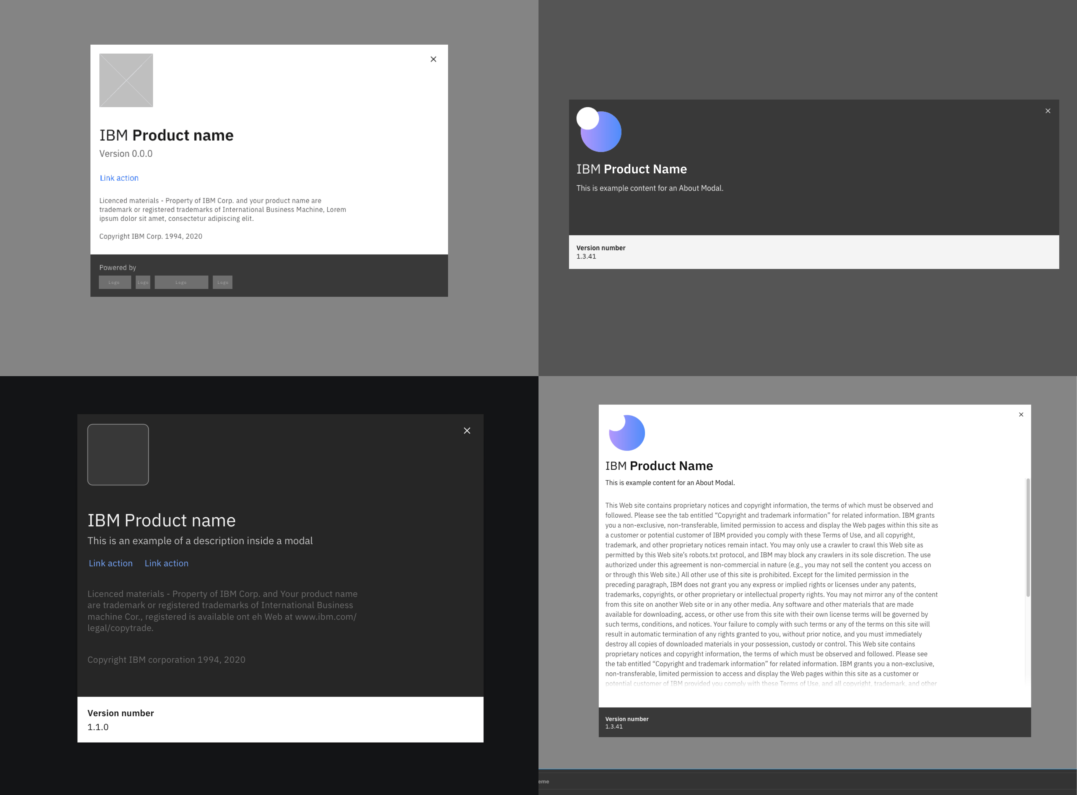
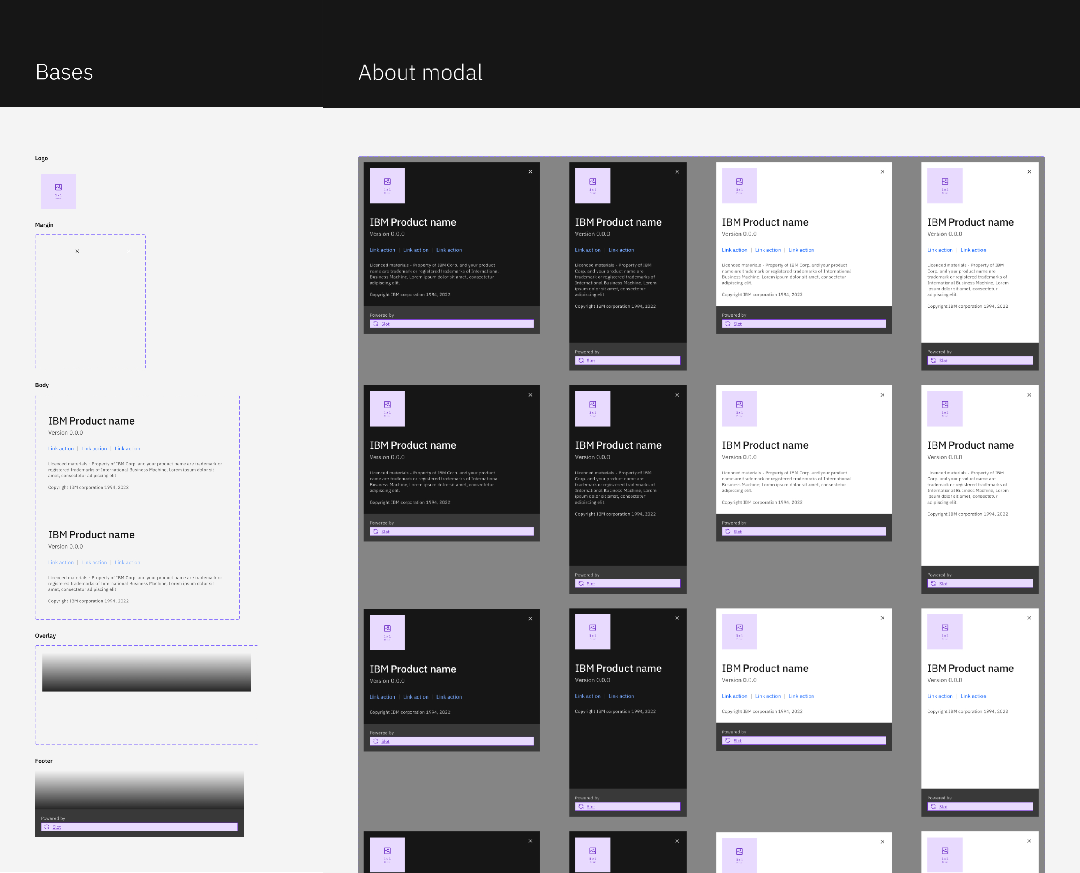
In Figma, I broke the component down to its ‘base’ parts, which includes the logo, links, legal content, and scroll overlay. Finally, I combined them into their frame with the different variants. With a few tweaks, feedback, and a link to their documentation and code, I finished. Additionally, I added descriptions and links to the Carbon for IBM Products site.
Within the first week, I completed the initial version, including 28 versions of the About modal. This felt wrong, so I attended a critique with fellow Figma experts to better understand Figma’s variant feature and learn to use it more efficiently. I separated the theme, margin, and footer variants, and used a new gradient token. Afterward, I pushed for a final review to be merged and published.
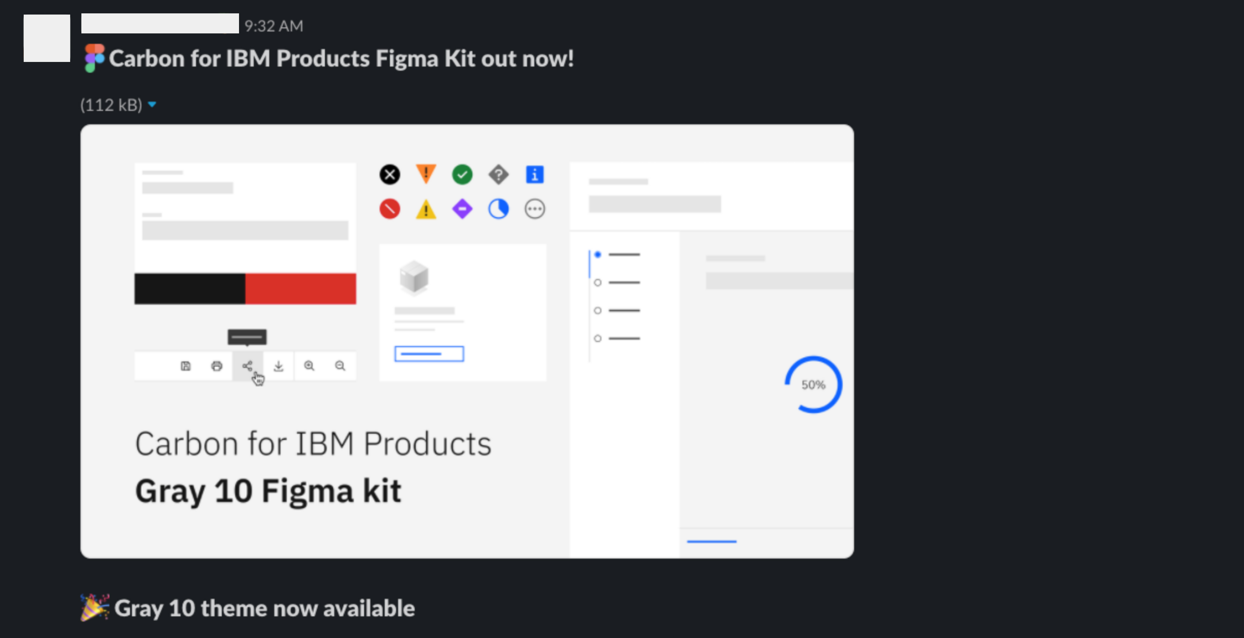
Note: Around this time, the Carbon team announced v11. A huge accomplishment for IBM and the Carbon team.

The Carbon 10 Grey 10 kit was published on Figma on April 1, and the Grey 100 kit on April 27. Over the next week, we fixed many bugs, continued critiques, and made minor changes. We had 74 teams use the Grey 10 and Grey 100 themes after the first 60 days.
Everything was going well until Figma’s annual conference, Config 2022. A bunch of new features were announced but what stuck out was ‘Component properties’. This was a brilliant feature that provides adjustments to create variations and instances of a component. Sounds great in theory but I needed to revisit the About modal in hopes it could improve the component efficiency.
Before we move on, I want to recap the last few months:
With all of this happening, I reconvened with the team and began to plan the next iteration. With Carbon 11, Figma’s Component properties feature, and team feedback, I created another plan.
I began by swapping libraries and changing tokens. A deceiving and tedious task to find the wrong color token and swap it with the correct one. Next, I broke the About modal into ‘base’ and item’ parts. Separating them made it easier to adjust the About modal for the other themes and future versions. Finally, I added component properties: size, theme, footer, and scroll. These make it easier to switch between the 28 different variants based on the designer’s requirements.
Finally, I completed the new Carbon 10 version of the component.
And I was even able to decrease the each aspect using Carbon 11.

On Oct 27th, we published the Carbon 11 kit. Over the next week, we fixed many bugs, continued critiques, and made minor changes. Demonstrations of the new components, Figma features, and usage began shortly. I hosted team meetings to showcase the additions to promote migration for designers moving to Figma.
Carbon is vital to IBM, and we continue increasing adoption across the company. Building this system helps center the team around creating incredible experiences for our products. We are bettering ourselves to iterate quicker and more innovative. We'll continue to repeat and ensure we meet the highest standards.
Read more on the Carbon Design System website.